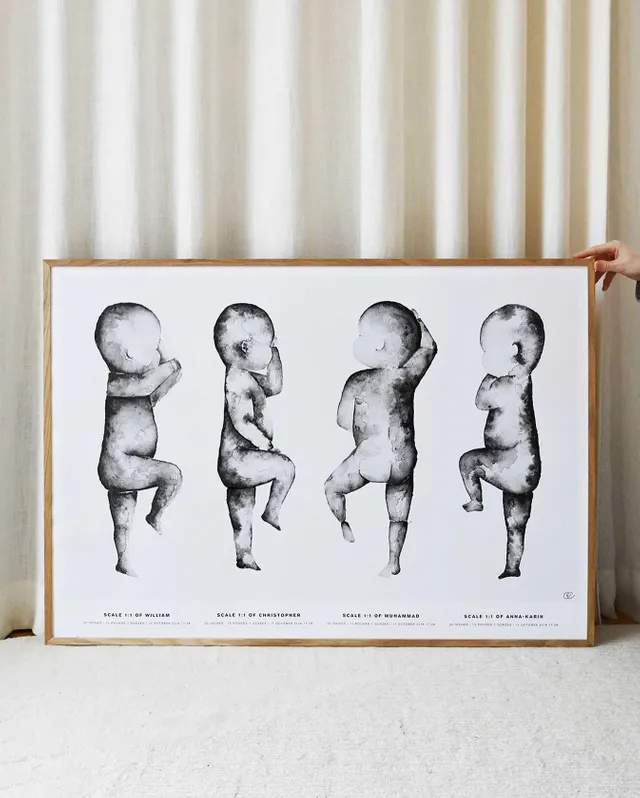
Designing a birth poster is a wonderful way to celebrate and commemorate the arrival of a new baby. It serves as a unique and personalized piece of art that captures the details of a child’s birth in a visually appealing manner. Whether you are creating a birth poster for your own child or as a gift for someone else, here are some tips and tricks to help you design a beautiful and meaningful birth poster.
Gather the important details: Start by collecting all the relevant information about the baby’s birth. This typically includes the baby’s name, date of birth, time of birth, weight, and length. You may also want to include the baby’s zodiac sign or any other significant details that are meaningful to the parents.
Choose a style and theme: Consider the overall style and theme you want for the birth poster. Do you prefer a minimalist design, a whimsical illustration, or a more traditional look? Think about the nursery’s decor and the parents’ preferences. This will help you select colors, fonts, and graphics that align with the desired style.
Select a layout: Decide on the layout of the birth poster. You can opt for a horizontal or vertical orientation, or even a square format. Consider the available space where the poster will be displayed, and the amount of information you want to include. Experiment with different arrangements until you find a layout that looks balanced and aesthetically pleasing.
Typography matters: Pay attention to the fonts you choose for the birth poster. Select a font that is clear, easy to read, and complements the overall design. Consider using a mix of fonts to differentiate important details like the baby’s name or birthdate. Avoid using too many different fonts, as it can create a cluttered and uncoordinated look.
Play with colors: Colors can evoke different emotions and set the tone for the birth poster. Consider using a color palette that aligns with the nursery’s decor or the baby’s gender. Soft pastels often work well for a gentle and soothing atmosphere; while bold and vibrant colors can create a more energetic and playful feel. Remember to maintain good contrast between the text and the background to ensure readability.
For example, if the baby’s parents are avid travelers, you could incorporate a world map or a hot air balloon. These elements will add a personal touch and make the poster even more special.
 Balance and simplicity: Keep the design clean, balanced, and uncluttered. Avoid overcrowding the poster with too many details or graphics. Leave enough white space to allow the information to breathe and make the design visually appealing. Remember, simplicity can often have a powerful impact.
Consider print quality: When designing a birth poster, keep in mind the intended print size and quality. Ensure that the resolution of the images and graphics is high enough to avoid any pixilation or blurriness when printed. Choose a reliable printing service or consult with a professional designer to ensure that the final product meets your expectations.
Frame it beautifully: Once the birth poster is printed, select a suitable frame that complements the design and the nursery’s decor and check here https://birthposter.com.au. Consider using a mat board to add an extra touch of elegance. Display the framed birth poster in a prominent place where it can be admired.


